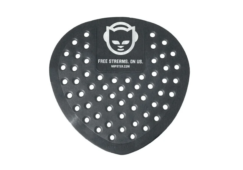
Napster
The idea behind the Napster campaign was simple. Napster forever changed the definition of “pirate,” so we decided to own it.
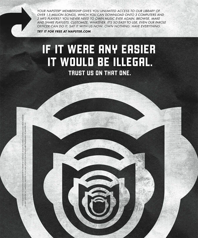
Our art direction inspiration came from the Jolly Roger. The stark graphic look and the association with “piracy” was a perfect backdrop for a reimagined Napster embracing its heritage.
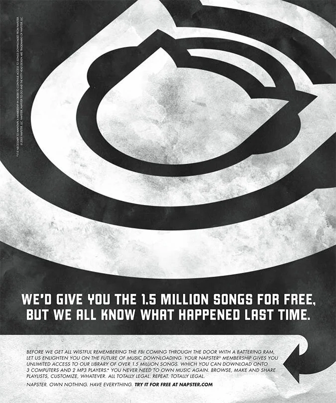
The Napster kitty head was redrawn as a monotone logo. The face was removed to make the shape more iconic and less cartoonish.
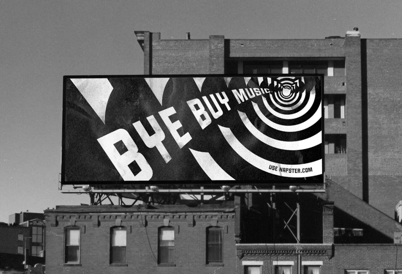
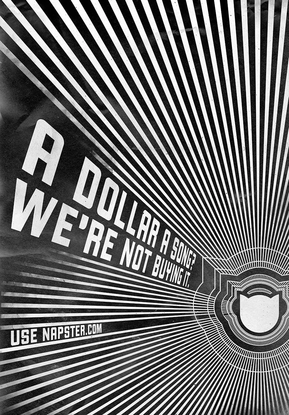
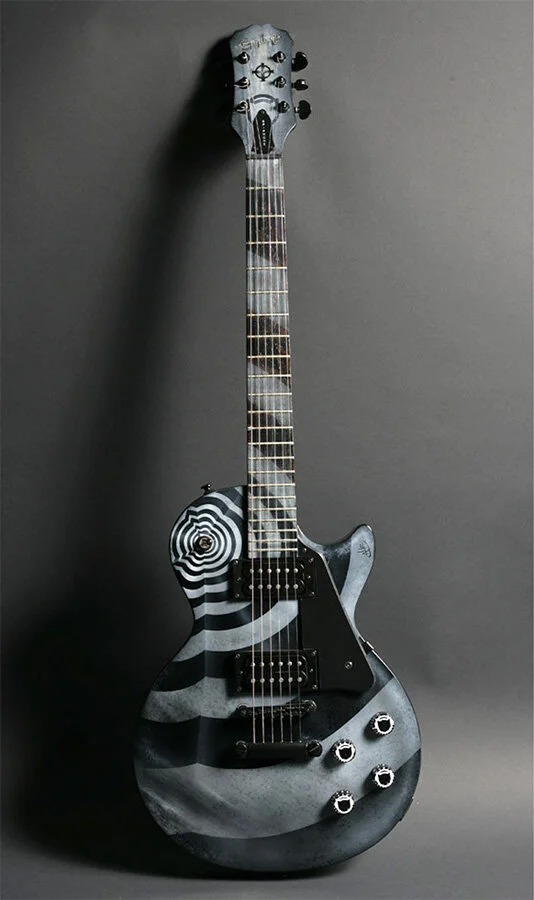
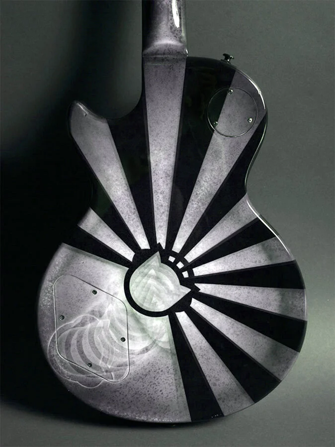
The updated Napster identity set the stage for our primary art direction. We focused on the primary shape of the logo and created a set of sonic patterns to reinforce the nature of the service. It intends to draw people in, so you can get lost in the world we’ve created, similar to how you can lose yourself in music.
National TV
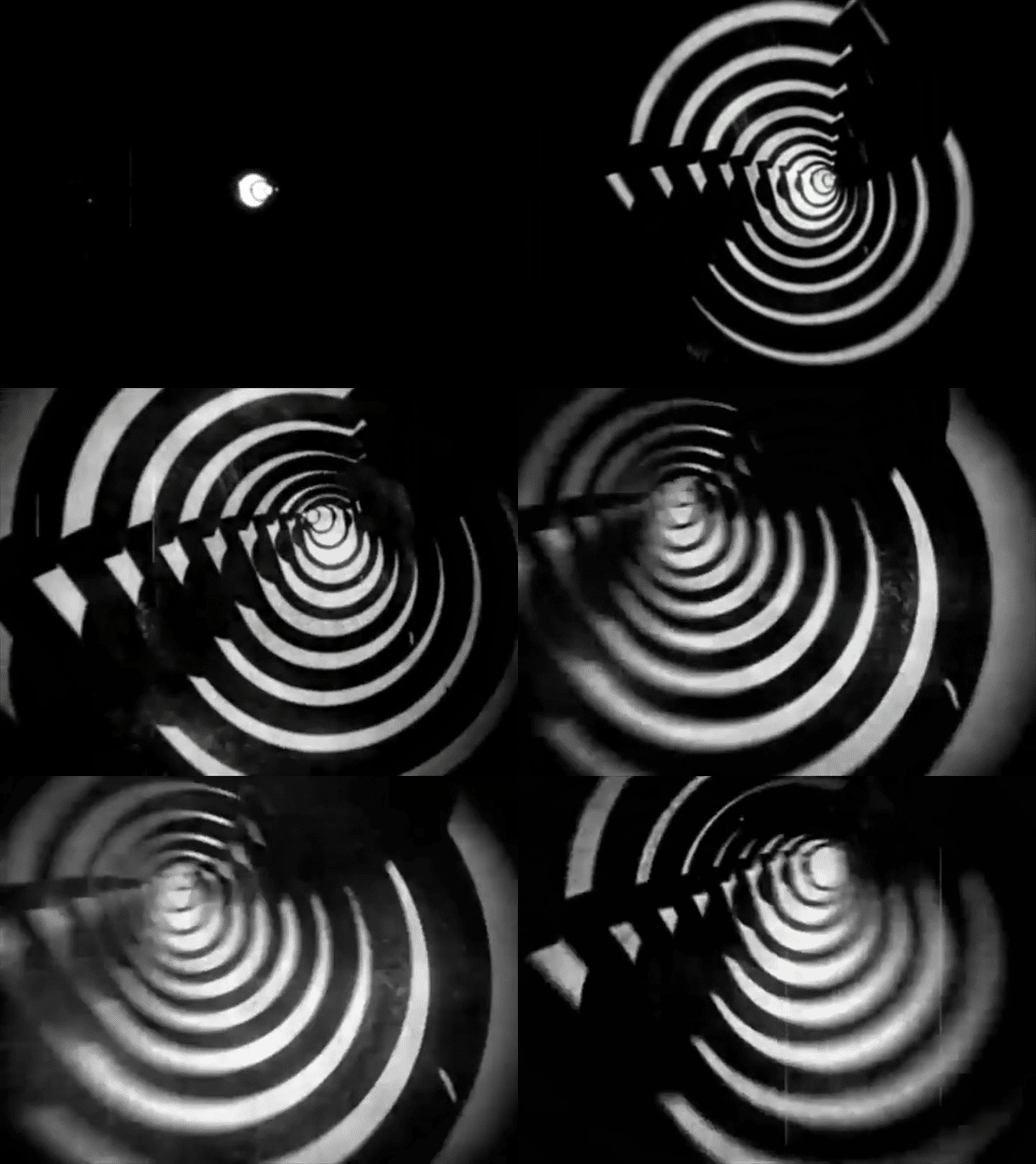
A series of "pirate" TV spots aired nationally, with a glitchy broadcast and hypnotic voiceover.
I customized a font specifically for Napster, and made appropriate for globalization. The typeface is Napster Kraftwerk, based on Chank’s Kraftwerk font. It’s a constructivist font associated with ultranationalism. It’s a perfect pairing for the drone, authoritarian voice of the Napster brand in our campaign.
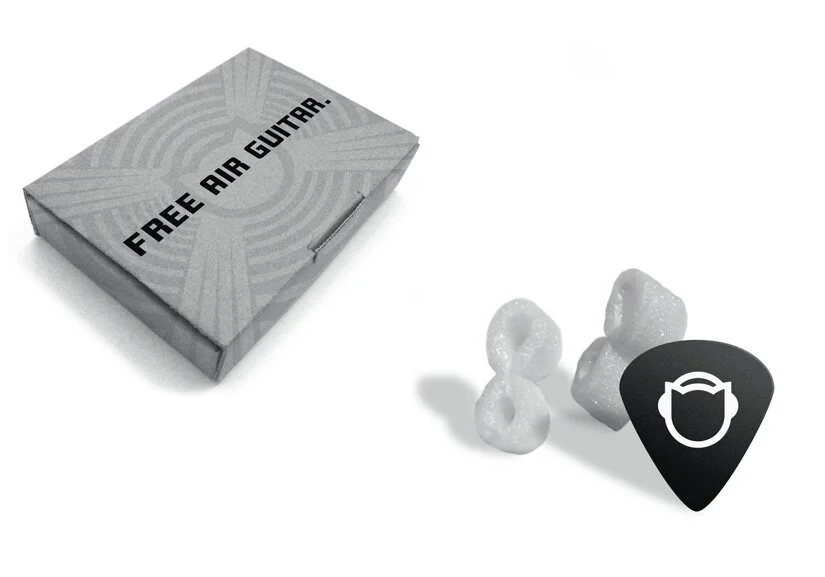
PR, DM & Swag


